Author
Oluwaseyi
publish Date
Dec 11, 2025
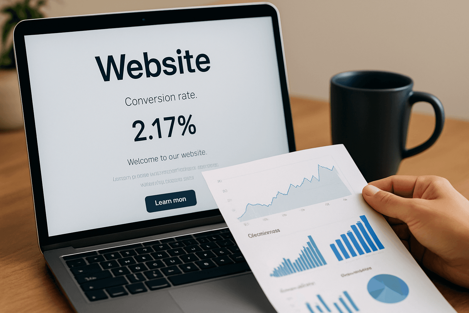
5 Signs Your Homepage Is Killing Conversions
Your homepage is usually the first impression people get of your business — and in those first few seconds, they decide whether to trust you, keep scrolling, or leave.
Most homepages don’t suffer from one big mistake but from a collection of small ones that quietly destroy conversions.
Here are five clear signs your homepage might be pushing customers away instead of pulling them in.
Your Hero Section Doesn’t Explain What You Do (Immediately)
If someone lands on your site and can’t understand what you do in 2–3 seconds, they will bounce.
Common problems:
Vague headlines (“We bring ideas to life”)
Generic stock photos
No clear benefit
Too much text
Your hero should answer:
What do you offer?
Who is it for?
Why does it matter?
A great homepage makes clarity its superpower.
There’s No Clear CTA (or You Have Too Many)
Your homepage should guide the visitor toward ONE main action.
If you have:
too many buttons,
buttons saying different things,
CTAs that are too small,
or no CTA at all…
…visitors won’t know what to do next.
Your CTA should feel obvious, not hidden.
Examples:
Book a Call
View Services
Get Started
When you try to make visitors choose between too many things, they choose nothing.
Your Design Looks Outdated or Inconsistent
People judge your credibility by your design before they even read your text.
Signs your design is hurting conversions:
Too many font sizes
Colors that clash
No spacing or breathing room
“Template-looking” layout
Old or low-quality images
Modern design builds trust.
Outdated design breaks it instantly.
And on the internet, trust = conversions.
Your Homepage Is Overloaded With Information
Beginners often try to cram everything onto the homepage:
About section
Services
Pricing
Gallery
Testimonials
FAQ
Every detail ever known to mankind
But the truth is:
Overloaded homepages overwhelm visitors and reduce conversions.
A high-converting homepage gives people just enough information to understand:
Who you are
What you offer
Why they should care
What to do next
Less scrolling, more clarity.
Your Homepage Isn’t Built for Mobile First
More than half of your visitors are on a mobile device — but many homepages break on smaller screens.
Mobile conversion killers:
Text that’s too small
Buttons too close together
Hero section cut off
Images that overflow
Heavy files that slow loading
If your homepage isn’t optimized for mobile, you’re losing conversions without even realizing it.
A good homepage design should feel perfect on mobile and enhanced on desktop — not the other way around.
Final Thoughts
Your homepage isn’t just a design.
It’s a sales tool, a trust builder, and your brand’s first impression.
If it’s unclear, outdated, overwhelming, or confusing, it’s silently killing conversions.
But the good news?
Small, intentional changes can transform it into your highest-performing page.
Need a High-Converting Homepage?
I design clean, modern, conversion-focused websites using Framer — built to make people trust you, understand your offer, and take action.
If your homepage needs clarity, structure, or a complete redesign, I can help you turn it into a real conversion asset.
Send me a message and let’s fix your homepage.
